Duquesne Athletics
Duquesne Unveils New Logo, Uniforms
The Duquesne athletic department unveiled a new logo and uniform concepts for its 17 athletic programs on Wednesday, continuing the relationship the school has had with Nike with a new primary logo.
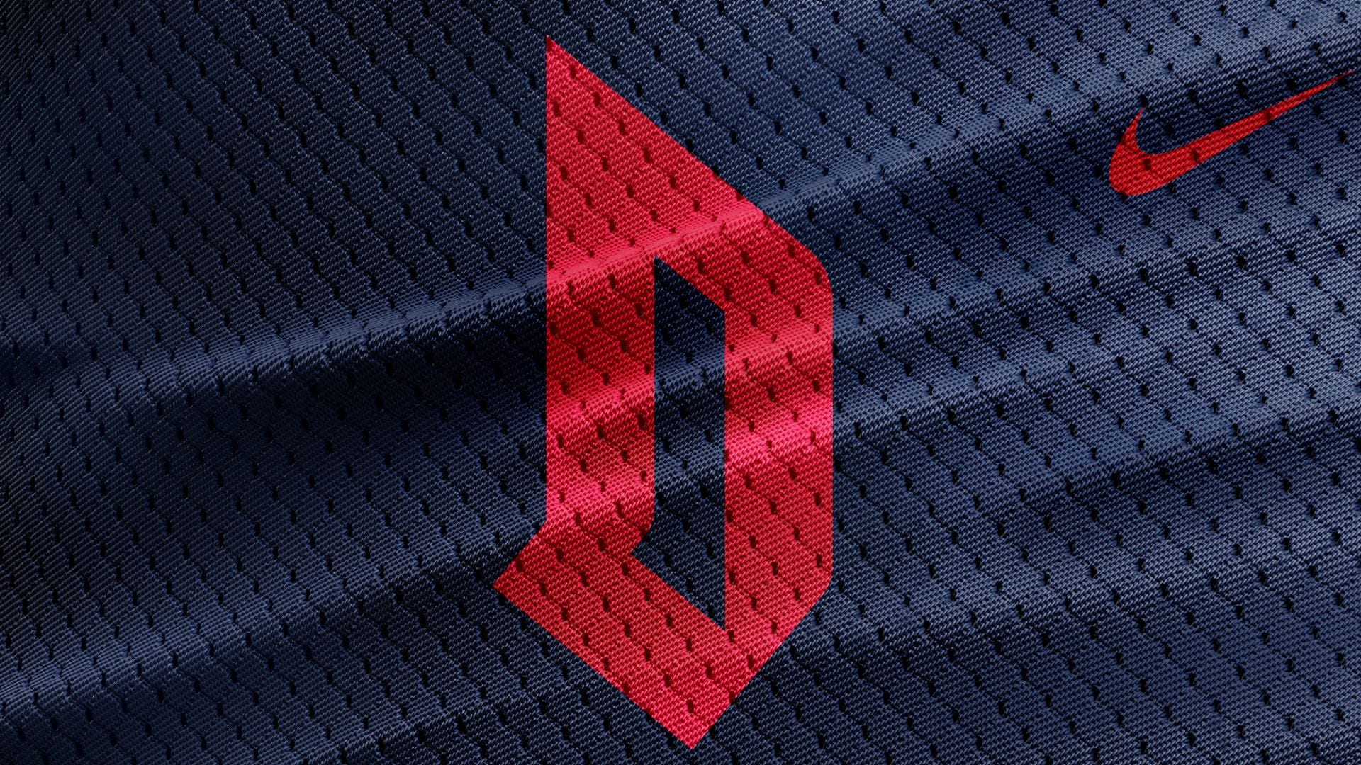
Gone is the Old English “D” logo that has been the primary mark for Duquesne athletics and the university at large for years. In as a modern, italicized “D” with clean lines and an accompanied wordmark, developed in concert with the branding agency Change Up.
The change comes as Duquesne is building a new primary home for its indoor sports teams, UPMC Cooper Fieldhouse, on the site of A.J. Palumbo Center.
“This is the ideal time to reimagine our brand identity,” said Duquesne Director of Athletics Dave Harper. “Having a strong and recognizable mark is essential as we continue to elevate the profile of Duquesne athletics.”
The set of logos kept the school’s familiar red, white and blue color palette, while introducing a second, lighter shade of blue.

The school also unveiled an alternate “DUQ” logo with a more straightforward typeface.


